How to Design the Perfect Café Logo for Your Small Business
- Kamilla Sims
- May 2, 2025
- 2 min read
Your café logo is the first impression of your coffee shop brand. A strong logo design communicates your vibe, attracts customers, and builds recognition. A generic café logo design can make your business forgettable. Whether you’re opening a new coffee shop or rebranding, here’s how to create a café logo that makes an impact.
You logo is often your cafe's first impression, so you've got to make it unforgettable. A strong cafe logo attracts the right customers and lets them know what to expect by setting the tone. It's a must for insuring the customers get the message you want to deliver. Need a custom logo? Let's create something amazing together!
Step 1: Define Your Cafe's Identity Before Designing
A logo needs to match your cafe's vibe and ideal audience. You want to make sure it tells the story that alines what you envisioned for your cafe. A cozy book store cafe is going to need a totally different logo look form a modern espresso bar. So make sure you choose colors fonts and styles that reflect your brand. Learn more about how brand identity and your logo interact.

Step 2: Choose the right Logo Style
You've got 3 choices:
Wordmark Logo: This is a logo that show cases your cafe's name, deriving most the intrust from typography/ font. Think of something like Disney or Coca-Cola's famous fonts.
Illustrative Logo: Somewhat self explanatory this is a logo that relies on illustration. Think of something like the World Wildlife fund or the Starbuck's siren.
Combination Logo: A logo that uses text and illustration.
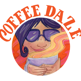
Tip: Hand-drawn logos feel more artisan and unique! There's nothing wrong with having a wordmark logo in your back pocket but people tend to remember images better than words.
Wordmark Logo Illustrative Logo Combination Logo
Step 3: Colors & Typography Matter More Than You Think
Colors affect emotion and perception. Warm brown tones can create a cozy cafe vibe. Green earth tones can create a feeling of being healthy or environmentally conscience. Black with splashes of color can feel rebellious. ect. Your fonts need to be easily legible while still matching your aesthetic.
Tip: Avoid generic Canva templates, custom typography makes a HUGE difference. A professional brand or logo designer will never use canva fonts they'll download, buy or create a custom one and customers can tell.
Step 4: Make Sure Your Logo Works EVERYWHERE
Your logo should look great on: storefront signage, menus & packaging, your social media & website, coffee cups, merch and anywhere else you want it.
Tip: A vector-based file ensures perfect scaling/ size changing.
Step 5: Get a Custom Logo that Stands Out
Unless you used to be a professional graphic designer DIY logos can often look cheap, while professional, hand-drawn logos set you apart. A generic coffee cup or blocky type face is never going to stand out next to a custom illustration with unique (and still clear) lettering. The best solution is to work with a designer (I'm available) to create a one-of-a-kind cafe logo. Friendly reminder why human designers are more effective than AI
A great logo is an investment that pays off. Let's design one that makes your brand unforgettable! My Process & Past Projects


Comments